Urban Gardening Supply Shop

Platform
Print
Responsive web
Responsive web
Year
2023
Keywords
Creative visual design
Branding
Branding
About
As part of my graphic design exploration, I developed a brand identity for a small urban gardening supply shop based in Hackney, East London. I created the name, logo, poster series, and a responsive website for the brand.
Key Inspiration 1: The Victory Garden Movement in WWII
The brand identity of DIG ON is rooted in the concept of empowering urban dwellers to make meaningful contributions to our climate and environment through gardening. This idea of gardening for a greater cause draws inspiration from the Victory Garden Movement during World War II—a widespread campaign initiated by the governments of the United States, Canada, the United Kingdom, and other Allied nations. The movement encouraged citizens to grow their own vegetables, fruits, and herbs to alleviate pressure on public food supplies and support the war effort by boosting local food production.
I looked to war propaganda posters for inspiration, which heavily influenced my choices in naming, tone of voice, color scheme, and other aspects of the brand identity.
- Red was chosen as the primary color because it’s expressive and conveys a sense of urgency, aligning with the brand’s goal of motivating people to take action against climate change through gardening.
- The brand’s tone of voice is motivational, encouraging, and powerful, echoing the style found in propaganda posters.
- How I challenged the PM's assumptions and made evidence-based design decisions through research involving both statistical figures and in-depth qualitative insights
- I paid direct tribute to the history of victory gardens through retro illustrations.
- Clean-cut shapes used across the brand, such as in the app icon and buttons, are inspired by the powerful and courageous spirit of wartime efforts.
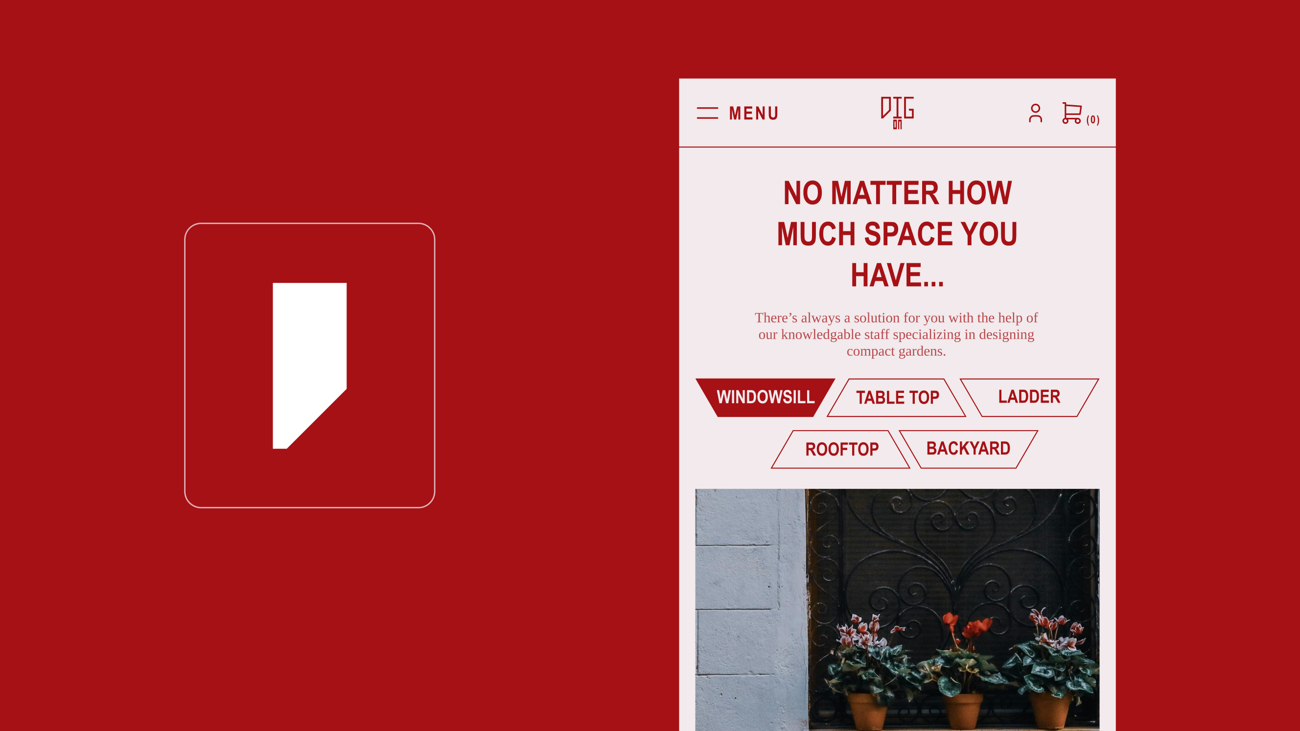
Key Inspiration 2: Accessibility and Flexibility of Urban Gardening
Another key inspiration for this brand identity is the accessible and versatile nature of urban gardening. Everyone can enjoy gardening, no matter how small their living space. Plants can be grown in almost anything—from shoes to tires to mugs—and can be placed anywhere, from window sills to shelves, rooftops to backyards.
To capture this versatility, I designed a variable logo that can host images and illustrations in different parts, much like how plants can be grown in various containers and locations. This design choice also reflects the idea that everyone can take action against climate change, regardless of who they are or what they do.